Category:
Branding
Client:
Willander Farm
A newly established family-owned farming brand from Australia that pays respect to the land they are based on and contributing to a healthy and more conscious society.
(MY APPROACH)
Humanizing a newly established brand is a difficult task. You need to really think about every possible touchpoint of the brand, and making sure it aligns with the values of the owners. In this case, a family with a focus on the two brothers that make it. I wanted to make a brand that they felt proud to show off.
(IDEA)
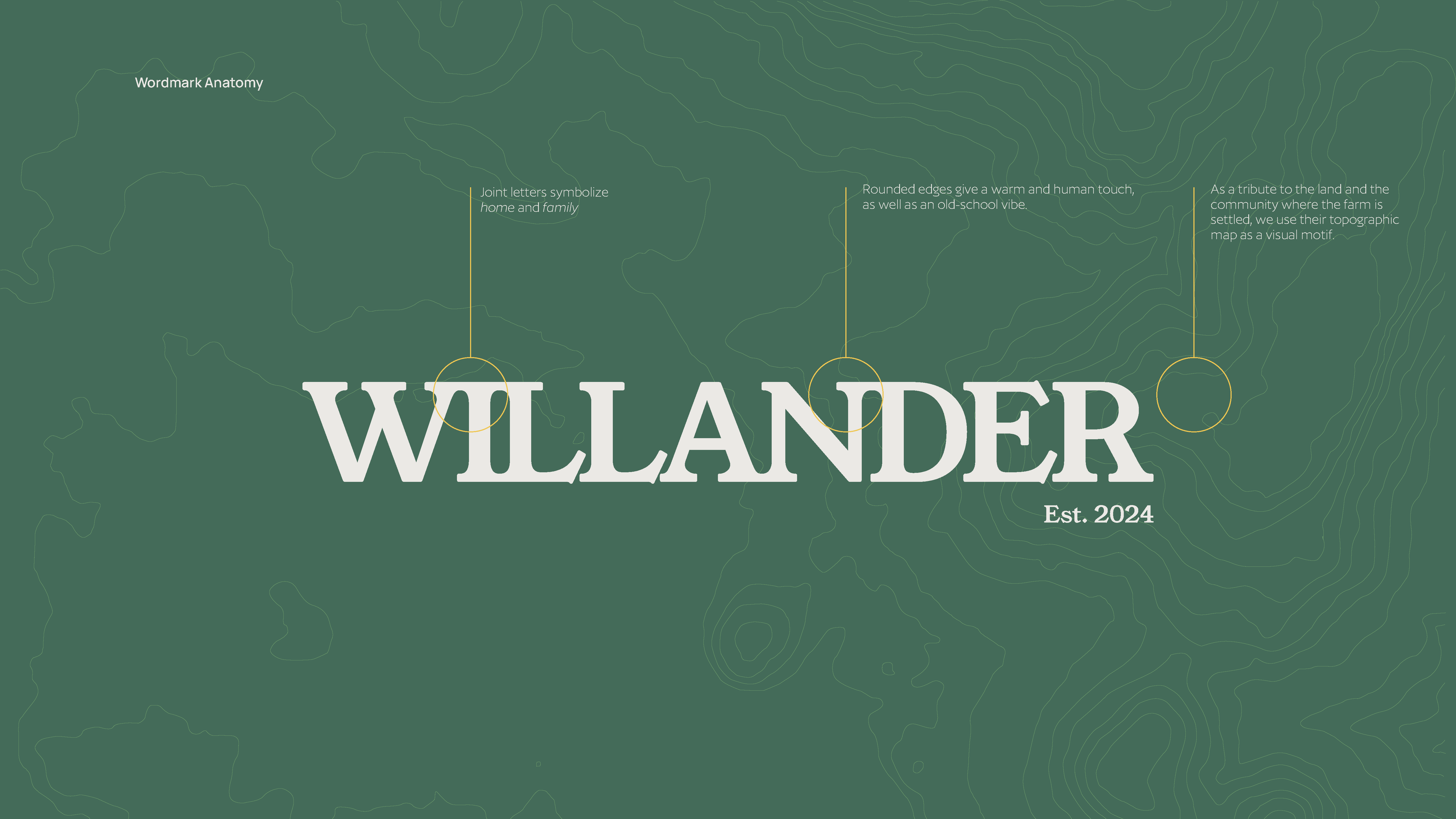
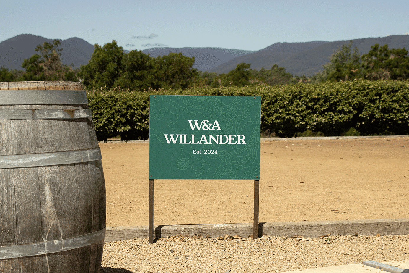
By making use of the topographic map where the farm is settled, I wanted to pay homage to the land that sits beneath. To the ancestors that populated that place ages ago, I wanted to create a brand that pays the due respect. So that map was used as the main background point.
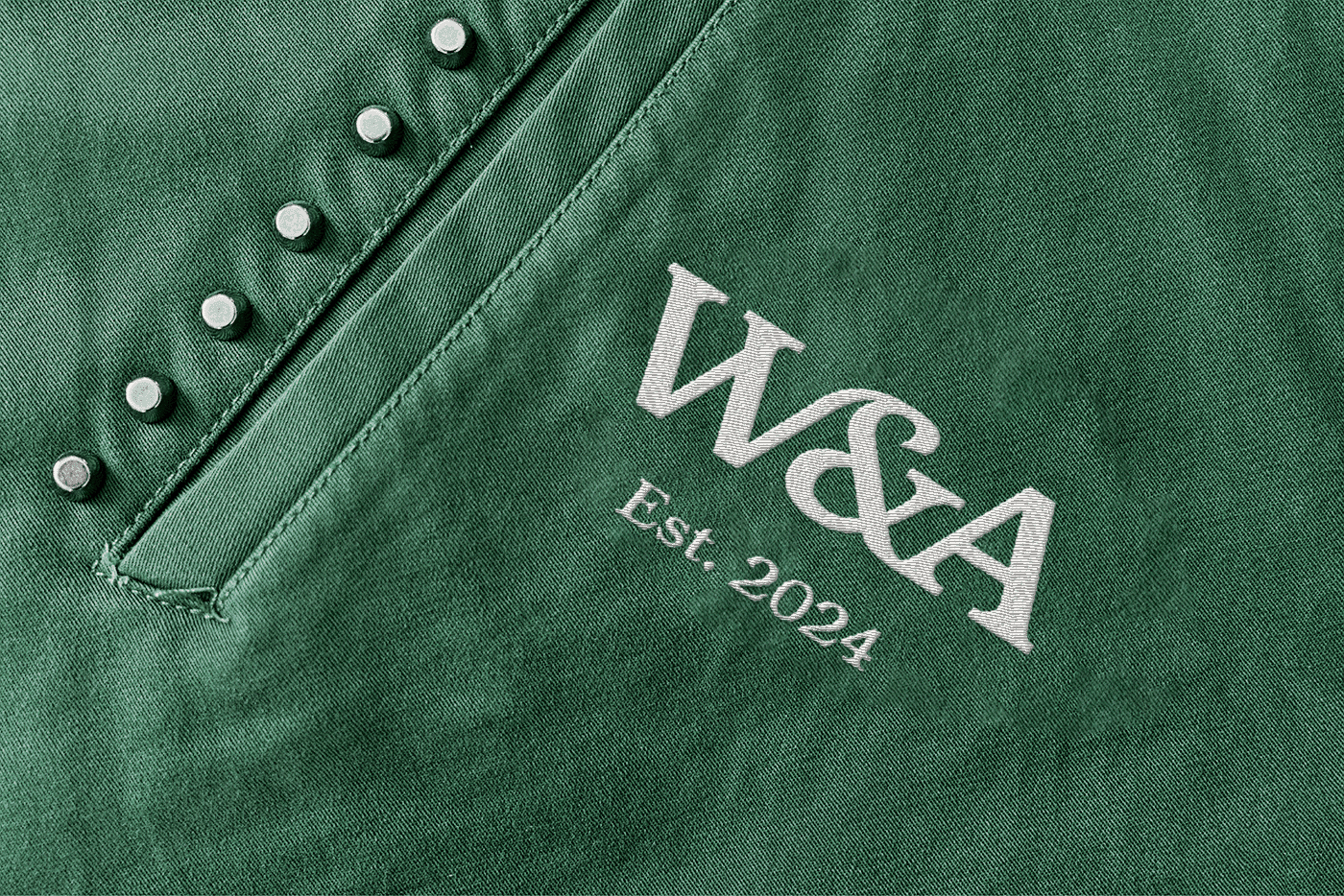
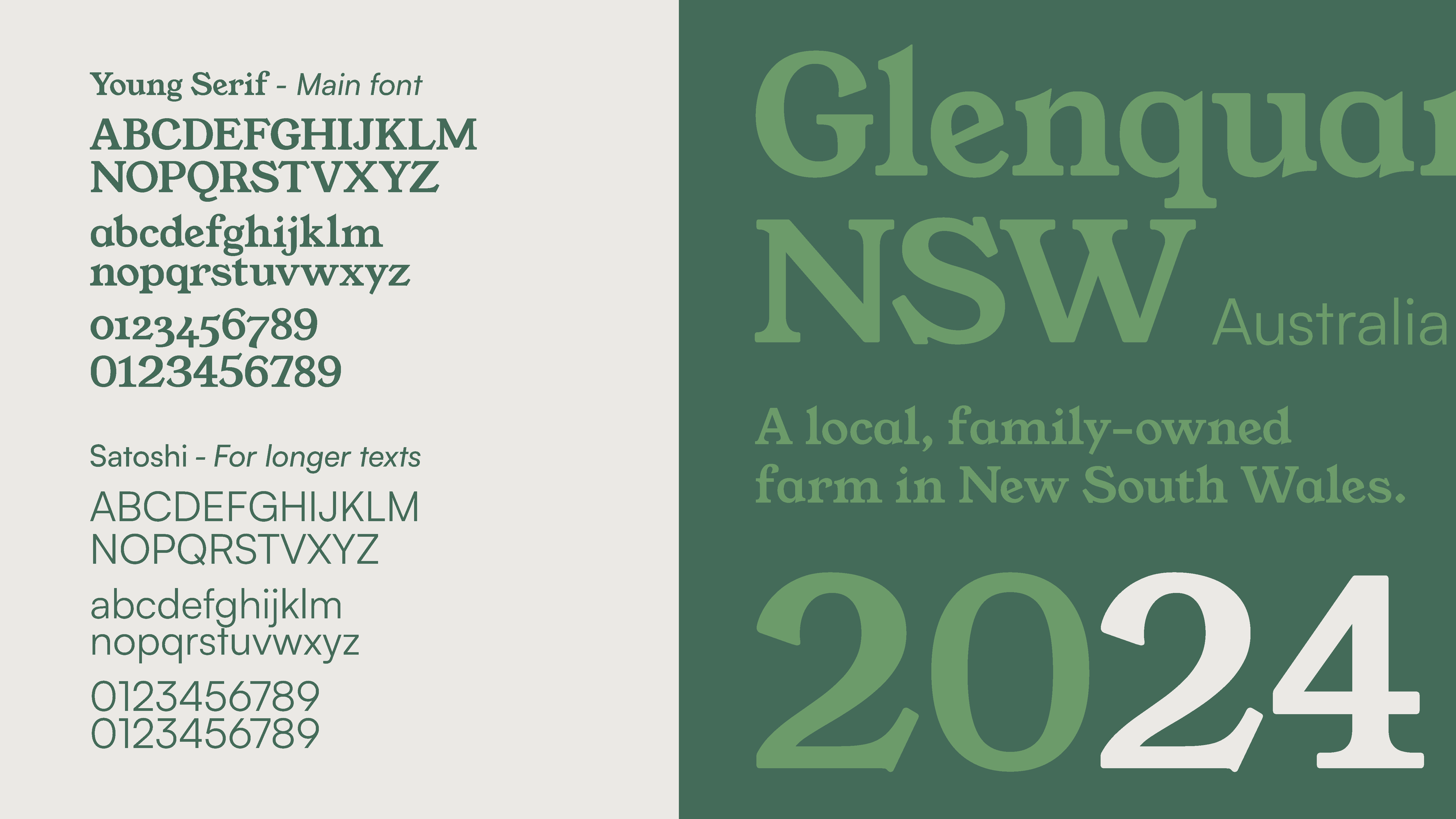
The wordmark, on the other hand, makes use of ligatures to signify the union and bonding in the family. A simple yet warm color palette and typographic choices go along this wordmark.
(CHALLENGES)
I didn't have too much information on what type of animals the farm would care of, so I decided to focus on the land, which is something permanent and not temporary.
(RESULT)
A friendly and warm identity for the brand, that touched every single of the values that the family wanted to display. Unfortunately, this design wasn't selected as final but was shortlisted.
